Why Use It?
Any Number of Columns
Don't be forced into having a fixed number of columns across a whole page. You can have whatever you want, wherever you need it.
Scales to Any Width
Because it uses percentages, your fluid columns will fit into any width. The margins (gutters) use percentages too.
It's Smart
There's no need to hack in any offsets or marginless final columns. It's the last time you need to use .last and the end of .end.
Put the Content First
Instead of fitting your content to your grid, you can make your grid suit your content. Doesn't that feel good?
It Fits In with You
It plugs into your existing HTML and CSS, it will be your friend in no time.
Simple Breakpoints
Mobile versions of the grid are already baked in, or you can cook up your own.
It's Easy
Use it on as simple or as complex a project as you wish. You'll be done in minutes.
No Maths Required
As long as you can count up to the number of columns you need you'll be fine.
The Markup
I'm only showing sample code for a 3 column layout here, but the Responsive Grid System goes all the way to 12, baby!
The HTML
<div class="section group">
	<div class="col span_1_of_3">
	This is column 1
	</div>
	<div class="col span_1_of_3">
	This is column 2
	</div>
	<div class="col span_1_of_3">
	This is column 3
	</div>
</div>
Don't forget to use HTML5!
The CSS
/*  SECTIONS  */
.section {
	clear: both;
	padding: 0px;
	margin: 0px;
}

/*  COLUMN SETUP  */
.col {
	display: block;
	float:left;
	margin: 1% 0 1% 1.6%;
}
.col:first-child { margin-left: 0; }


/*  GROUPING  */
.group:before,
.group:after {
	content:"";
	display:table;
}
.group:after {
	clear:both;
}
.group {
    zoom:1; /* For IE 6/7 */
}

/*  GRID OF THREE  */
.span_3_of_3 {
	width: 100%;
}
.span_2_of_3 {
	width: 66.1%;
}
.span_1_of_3 {
	width: 32.2%;
}

/*  GO FULL WIDTH AT LESS THAN 480 PIXELS */

@media only screen and (max-width: 480px) {
	.col { margin: 1% 0 1% 0%;}
	.span_3_of_3, .span_2_of_3, .span_1_of_3 { width: 100%; }
}
How It Works
.sectionsplits up the page horizontally. You'll need a few of these to break up the content, and you can use them in your main wrapper, or within other divs.
.coldivides the section into columns. Each column has a left margin of 1.6% (around 20 pixels on a normal monitor), except the first one. Using .col:first-child { margin-left: 0; } means you don't need to use class="last" anywhere. It works in all browsers since IE6.
.groupsolves floating problems, by forcing the section to self clear its children (aka the clearfix hack). This is good in Firefox 3.5+, Safari 4+, Chrome, Opera 9+ and IE 6+.
.span_1_of_3specifies the width of the column. Using percentages means it's 100% fluid.
@media queriesas soon as the screen size gets less than 480 pixels the columns stack and the margins disappear.
Hey did you notice that this page layout has 4 columns in some places, 3 in others and even 8 a bit further down*? That's because of the goodness baked right into the Responsive Grid System!
* provided you're looking at it on a screen larger than 768 pixels wide. On smaller screens it's, like, responsive.
Grid Size
Below you can see each row split up into the most available columns.
Two Columns
Three Columns
Four Columns
Five Columns
Six Columns
Seven Columns
Eight Columns
Nine Columns
Ten Columns
Eleven Columns
Twelve Columns
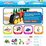
Who's Using It?
Apart from this site? Some of the other websites out there using the responsive grid system:


Let's Go to Work
Grab the code, plug in what you need, then relax. You will have a reponsive web site in about five minutes time.
Either Get The Lot
Contains the whole shebang
- the HTML
- the CSS for all layouts, from 2 to 12 columns
- media queries to stack the columns at less than 480px
Go on and Download the zip
Or find this on Github.
Or Just Take What You Need
1. Use the HTML as detailed above or grab an example.
2. Grab the column setup css.
3. Now choose the css for the number of columns you want. Paste them into your master css or reference them in the document head. They include media queries to stack them on smaller screens.
Release Notes
Launched 20th June 2012 this is the Responsive Grid System version 1.0.
Get in early! Buy low, sell high and all that.
Looking for a SASS version? Get it right here.
Or Make Your Own
Use the new responsive grid calculator to make your own. Decide the number of columns you want in a row & set the margin you want to use. Some sweet maths will do the heavy lifting for you.
What Margin is Best?
A margin of 1.6% gives you about 20 pixels on a standard monitor, but feel free to go large to suit your content.
Don't make the margin more than 10% or you'll end up with more margin than content!
Want Me to Do It For You?

I'm Graham Miller - I built the Responsive Grid System to help you get started, but if you need something a little more complex I'd love to do it for you. I build responsive websites for people in the UK and around the World.
Get in Touch
The best way to contact me is through Edward Robertson web design, where we craft web sites that work beautifully on every device. We've been creating websites since 1996 and we're still not tired.
You can send me an email or contact me in our Newcastle Office.